The idea for this blog post has been germinating since I finished my previous post. I knew I wanted to compare and contrast my experiences with various plotting methodologies in R and Python, but I felt there just wasn’t enough meat on the bone. It all comes down to a single takeaway: It’s much easier to create presentable plots using R and ggplot2 than any method I’ve attempted in any other language or library.
When drafting the aforementioned post, I wanted to complete it, top to bottom, in Python. I use ggplot2 daily at work, so I wanted to flex my Python muscles and see how the language and libraries had changed in the past year. For better or worse, they seem pretty much the same. That isn’t to say they’re bad; I just think they less approachable and have steeper learning curves.
Now for the disclaimers: I didn’t try out a recent version of Bokeh, which had recently gone 1.0. I didn’t try out Altair, which seems to have come a long way in the past year. I went straight for seaborn, which I remembered fondly. It was more opinionated than matplotlib, but didn’t have any tricks (Bokeh, with its dynamic charting) or really bold opinions (Altair’s declarative nature).
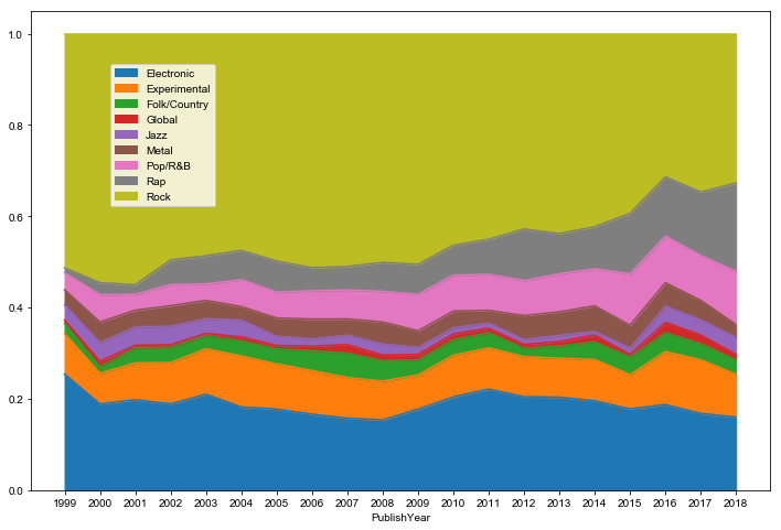
As you can see in my Jupyter notebook of the analysis, I really gave plotting in python an honest effort. Below is as far as I got toward plotting a stacked area chart after a half hour of tinkering. I can assure you, it felt like it took longer than a half hour.
The color pallete didn’t feel quite right and the text sizes still felt way off. I’m certain I must have changed a blue gazillion parameters.
Plenty of blog posts have been written about how ggplot2 “just makes sense” and how it lines up with its Grammar of Graphics. I’m not going to lie and say I was able to intuitively put together my final charts in my blog post without referencing the docs. I will say, however, that after I was done I didn’t feel that I had a kludgy solution or created an unintelligible mess of parameters. I will also say that I felt really solid about putting them on display for the world. I’m no graphic designer, and they weren’t perfect, but they were much better than I was able to cobble together in seaborn.
I think there’s compelling use cases for seaborn and the other aforementioned packages. having an all-Python stack, as was my original intent, is probably the most compelling. Seaborn is also great for exploratory data analysis. It has some really nice distribution visualizations. I can’t think of how to do those off the top of my head in ggplot, and I don’t think it’d be a one-liner. That being said, I felt things went off the rails quickly once I cared about the nit-picky details of my visualizations.
For those who have not tried out R or ggplot2, I think it’s worth giving it a trial run. Even if one has no other use cases for R, I think the plotting is solid enough to have it installed and ready-to-go as a domain-specific language for creating charts and graphs. The data visualization chapter of R for Data Science is a great primer for the uninitiated, written by the library developer himself.